

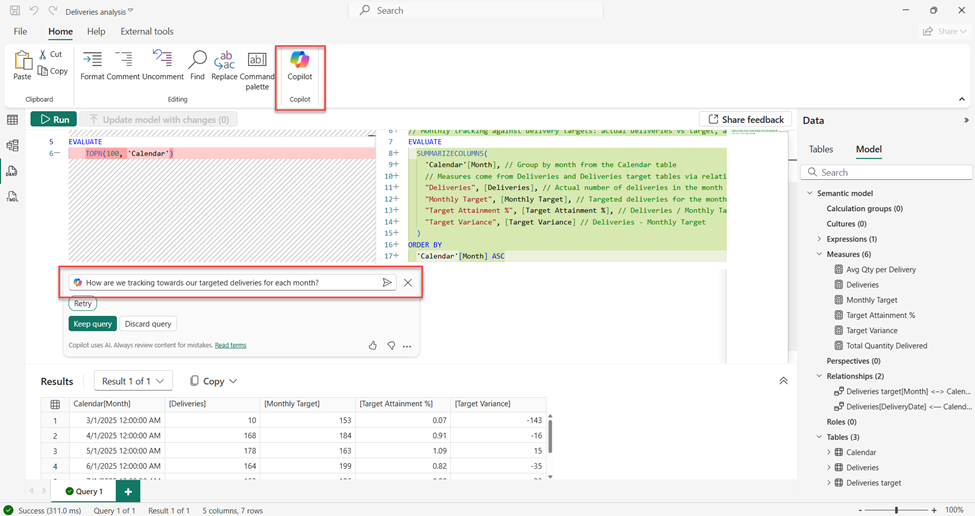
Copilot for DAX Query View
Copilot can now assist users in writing and explaining DAX queries directly in the Query View. It can generate or optimize code, or clarify what an existing query does.
How it helps: This feature saves time for users who work frequently with DAX and reduces the need to switch between documentation or forums while troubleshooting formulas.
Button Slicer
A new Button Slicer visual allows users to interact with filters through clickable buttons instead of dropdowns or lists.
How it helps: Dashboards become more user-friendly, especially when designed for clients or non-technical stakeholders who prefer visual navigation.
Visual Calculations in Embedded Reports
The Visual Calculations feature is now available in embedded environments, allowing calculations directly within visuals without editing the dataset.
Auto-Expand Table Columns
Tables now adjust automatically to fill available space in visuals.
How it helps: Small improvement, but it saves layout adjustment time, keeping reports cleaner and easier to read..
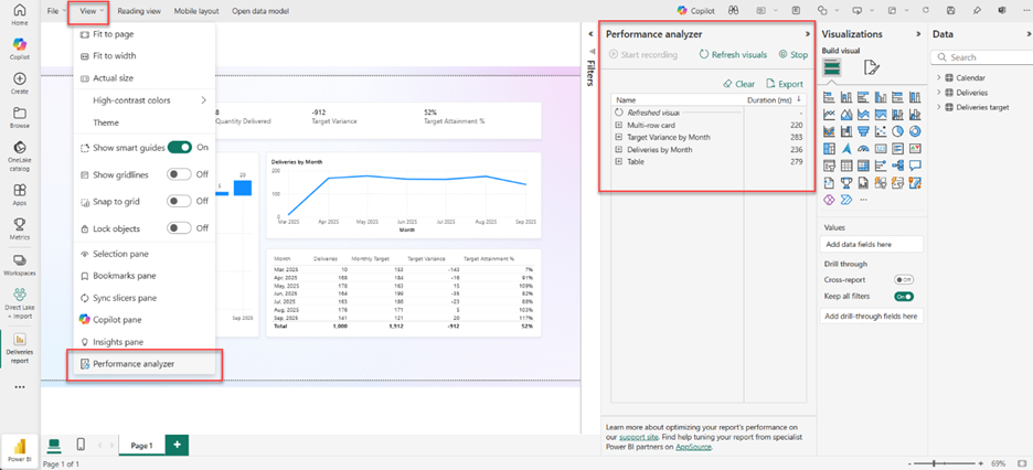
Performance Analyzer in Power BI Web
Performance Analyzer, previously limited to Desktop, is now available in Power BI Web. It tracks the time each visual takes to load, helping identify what’s slowing a report down.
How it helps: Users can test and optimize report performance directly in the browser, without needing the desktop version.
Export Query Results
Users can now export query results directly, making it easier to share datasets or move processed data into other tools.
How it helps: This update benefits teams that combine Power BI insights with Excel or Python workflows.
Power BI Desktop Support for ARM Devices
Power BI Desktop now supports ARM-based processors, which are becoming more common in lightweight laptops and tablets.
Azure Maps Migration
The built-in Bing Maps visual has been replaced with Azure Maps, improving rendering speed and geographic accuracy.
How it helps: : Mapping visuals now load faster and show better location precision, particularly useful for regional or field-based reporting.
New Visuals on AppSource
Several new visuals are available on AppSource:
- Sankey Chart by Powerviz – for showing flow between stages or categories.
- Drill Down Scatter PRO by ZoomCharts – allows interactive exploration of data patterns.
- Multiple Sparklines – adds mini-trend visuals inside tables.
-Performance Bar by JTA – highlights metrics with target comparisons.
-Financial Reporting Matrix v8.2 – improves layout for financial statements.
-BI Pixie by DataChant – converts report data into AI-driven insights.
How it helps: These visuals add flexibility for storytelling, analysis, and performance reporting across different departments.
Conclusion
These Power BI updates show steady progress toward better reporting efficiency and usability. None of them change how Power BI works at its core, but each one removes small barriers that slow users down.

