Why this update matters as teams enter 2026
Power BI has been shifting its focus from adding more visuals to improving how people interact with data. The January 2026 updates continue that direction. Instead of introducing flashy features, this release focuses on making analysis smoother, reporting easier to maintain, and AI assistance more grounded in real data models.
These changes matter not because they look impressive in demos, but because they reduce friction in daily reporting and decision making.
Copilot is becoming more usable in real analysis
One of the most meaningful changes in this update is how Copilot can now be accessed and used.
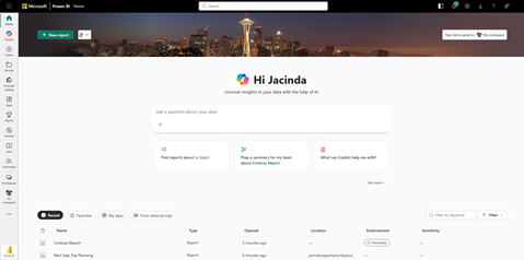
Copilot is no longer limited to being used only inside an open report. It can now be accessed directly from the Power BI home experience. This changes how people start their analysis. Instead of opening reports just to answer a quick question, users can begin with questions and move into reports only when deeper exploration is needed.
More importantly, Copilot can now reference specific reports and semantic models during conversations. This reduces one of the biggest risks of using AI in analytics, which is receiving answers that are generic or disconnected from actual business logic.
When Copilot works against approved models, it becomes less about generating text and more about explaining what already exists in the data.
The shift from the term “Prepped for AI” to “Approved for Copilot” may seem minor, but it signals an important mindset change. It encourages teams to think about readiness and clarity before enabling AI, rather than treating Copilot as something that can simply be switched on.

Reporting improvements that save time every day
Several updates in this release focus on reducing small but persistent frustrations that report builders face.
Field parameters now retain hierarchy levels when used across visuals. Anyone who maintains complex reports knows how often hierarchy selections reset or behave inconsistently. This change makes reports easier to update and reduces rework during revisions.
Modern tooltips are now generally available. Tooltips are one of the most effective ways to add context without cluttering a dashboard. With better control and consistency, they become a reliable way to explain metrics, trends, and anomalies exactly where users need that explanation.
Formatting improvements, such as better column auto-fitting and enhanced color selection, may sound minor, but they remove a surprising amount of manual effort. These are the kinds of changes that quietly improve productivity and reduce the time spent polishing reports before sharing them.

Clearer spatial insights with maps
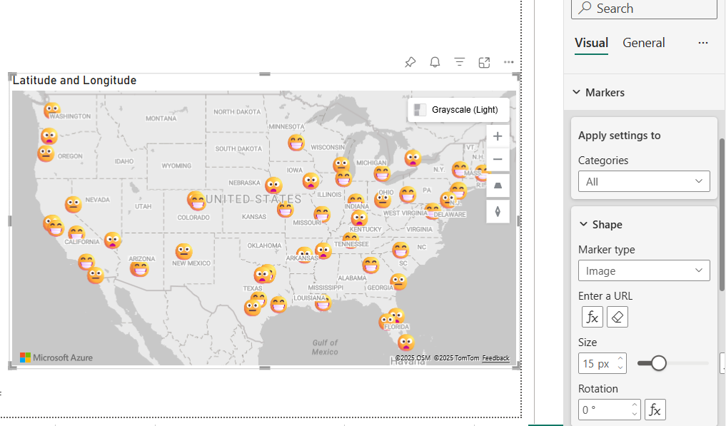
The Azure Maps visual now supports marker-based data more effectively. This makes it easier to represent point level information such as store locations, delivery points, or service coverage.
What these changes mean for everyday reporting
Conclusion
The January 2026 updates focus less on introducing new concepts and more on improving how Power BI is used in real professional environments. Copilot is becoming more grounded, report maintenance is getting easier, and everyday reporting friction is being reduced in practical ways.
To continue learning about analytics, reporting, and AI workflows through practical insights, subscribing to the newsletter is the best way to stay connected.


