
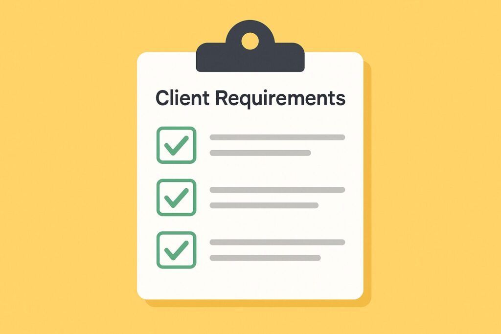
Begin with client requirements
- The starting point is not the data, it is the client’s questions. What do they really want to see? What decisions should this dashboard support?
- Confirm each requirement before building. For example, if the request is “sales performance by region,” ask if they also need trends over time or comparisons to targets.
- Keep a simple checklist and map every requirement to a chart or KPI card. This ensures no important question gets missed.
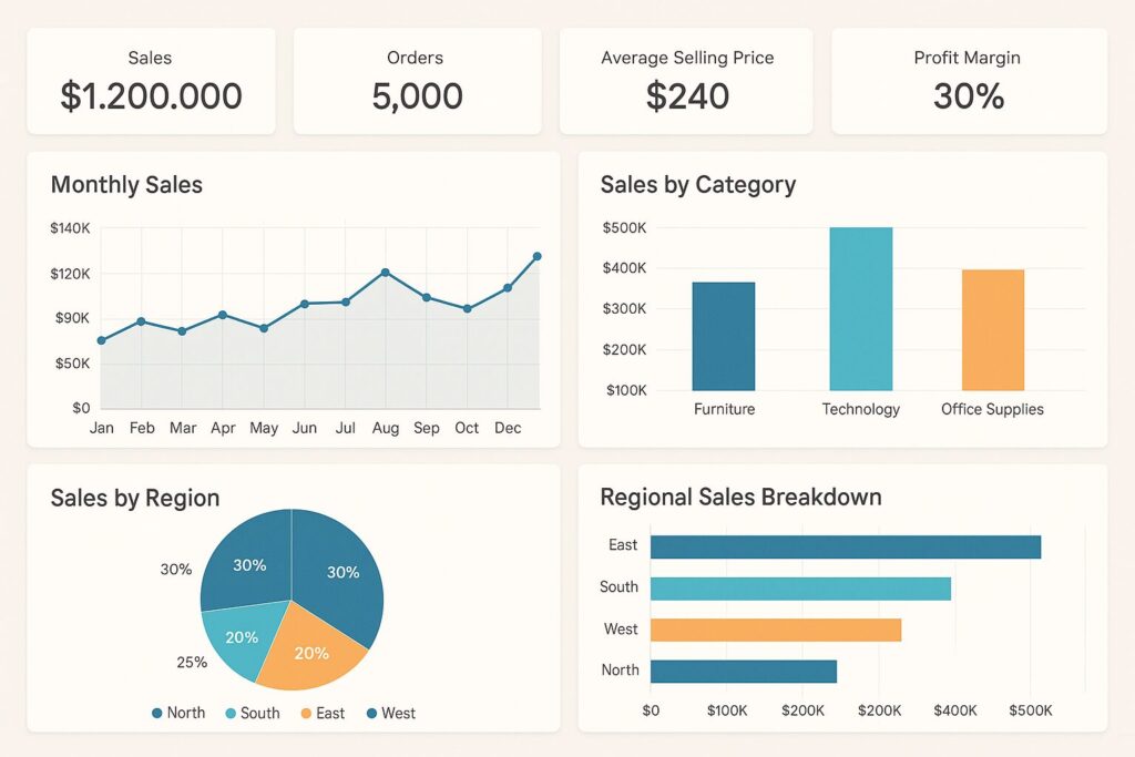
Highlight KPIs first
- Place the key KPIs at the top in a clean card or tile format.
- Keep numbers short and use consistent colors to show good vs bad performance.
- If someone only has 30 seconds, these KPIs should answer their first question.
Use visuals to show patterns
- Charts reveal patterns faster than tables. Use line charts for time, bar charts for ranking, and cards for single values.
- Keep tables for exports or drill-downs, not the main view.
Keep every visual focused
- Each chart should answer one question clearly.
- Remove extras like unnecessary labels, gridlines, or too many colors.
- Add short titles that state the insight, for example, “Sales grew 12% vs last month” instead of “Sales trend.”
Add context without clutter
- Show comparisons against targets or benchmarks directly in the chart.
- Use small indicators like arrows or sparklines instead of long explanations.
- The goal is not just to display numbers but to explain whether performance is on track.
Final check
- Step back and ask, “Does this dashboard answer all the requirements in one minute?”
- If not, simplify until the main story is clear.
Conclusion
Dashboards that can be read in one minute create clarity, not confusion. Start with client requirements, put KPIs upfront, keep visuals focused, and add only the context needed to make decisions.
If you want more tips like these, subscribe to our newsletter. Each month, we share updates and practical ways to use Power BI, Excel, Python, and AI to design reports that save time and guide smarter decisions.